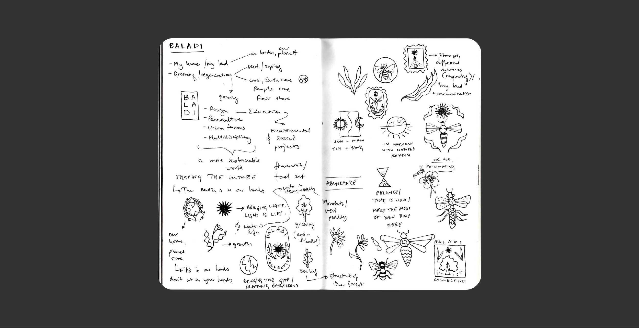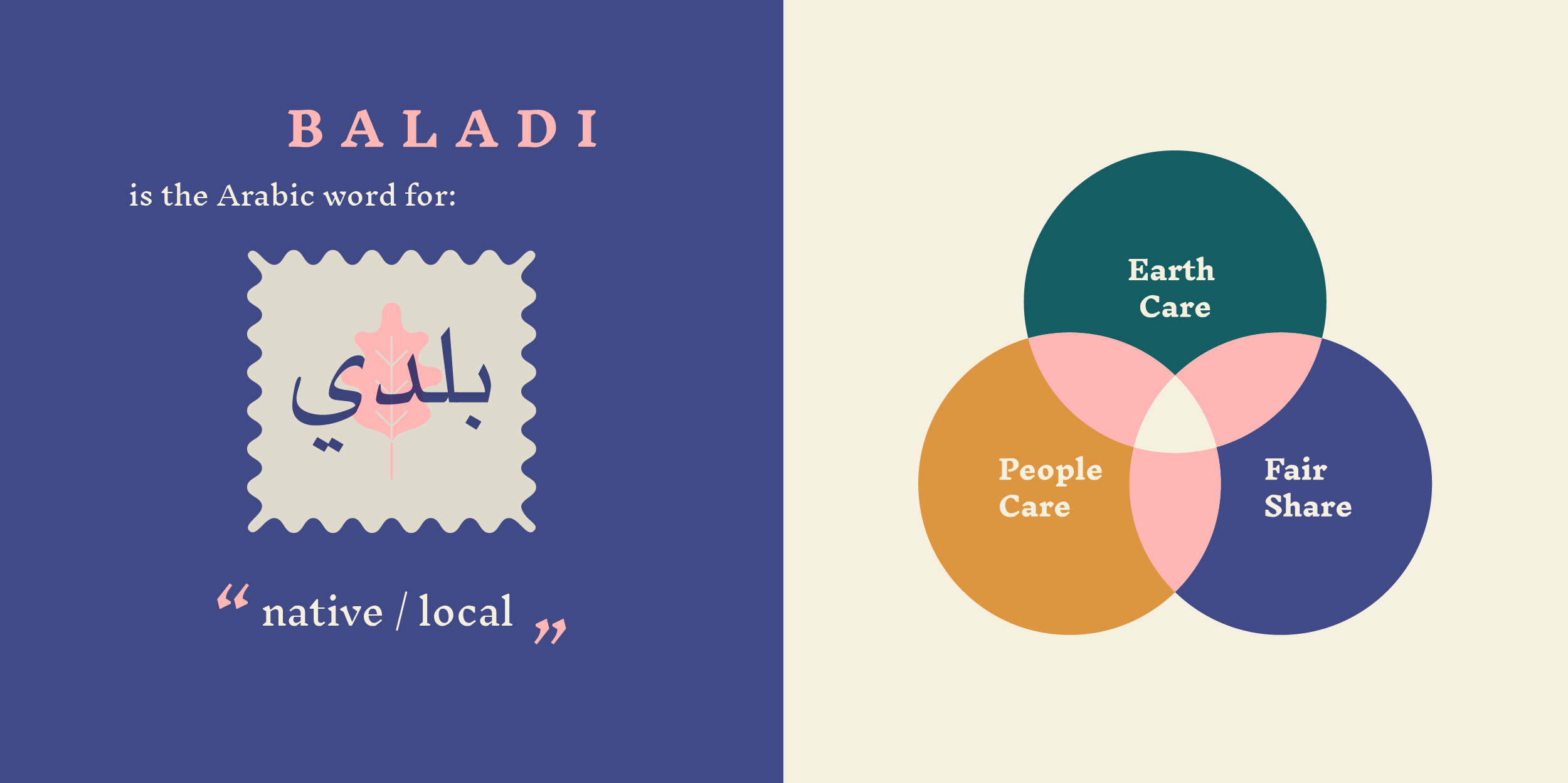
Baladi Collective sits at the intersection of ecology, agriculture, architecture and community, because we believe that social and environmental wellbeing go hand-in-hand. We aim to bring more life and abundance to both human and non-human ecosystems. By honouring ancient, localised knowledge and principles, and exploring innovative solutions and new insight, we design for impact and longevity, at at time when the planet needs it more than ever.
The idea for Baladi began when a number of the core team met at a Permaculture education centre in Portugal. As we sat around the fire discussing our ideas and ambitions, sparks flew. Though coming from different backgrounds and professions, we all shared a vision for positive change in the world. All of us were inspired by the Permaculture approach: designing regenerative systems based on the principles of nature. It made sense that our areas of creative and professional experience complemented each other’s perfectly. We realised that together, we could offer something really special and make meaningful impact.
And so the idea for Baladi Collective began. The first project we embarked on together was Ġnien Ħal-Far - bringing greenery, food growing and regeneration into a bare open centre for migrants and refugees in Malta. Follow @baladicollective to keep up with progress.
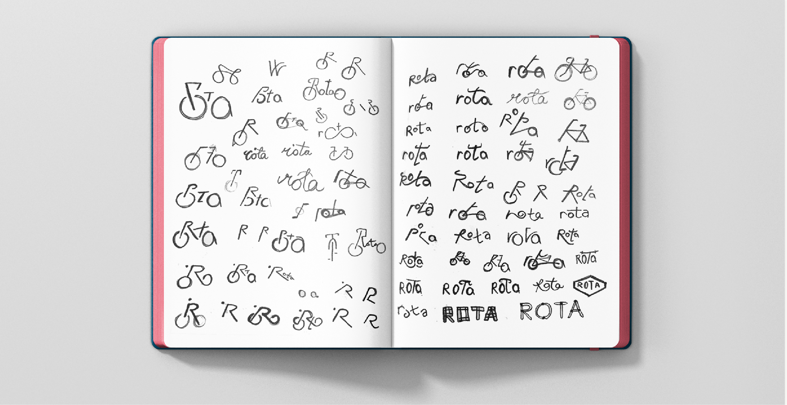
Rota are a bicycle advocacy group who lobby in favour of cycling, safety and accessibility on local roads. The identity I created revolves around a logo-mark that visually combines the ‘R’ for Rota, a cyclist, the sustainability sign, and the four brand values, represented in different colours. It can also work as a single-line icon. When expanded, the logo-mark also gives an impression of road networks, representing the road-safety and accessibility that the organisation campaigns for.
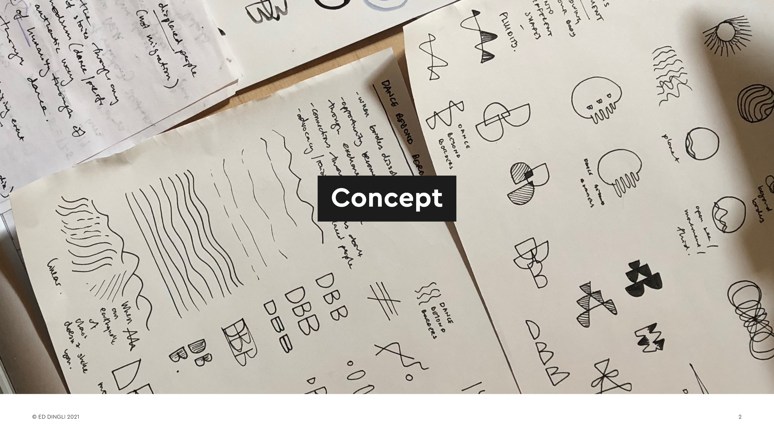
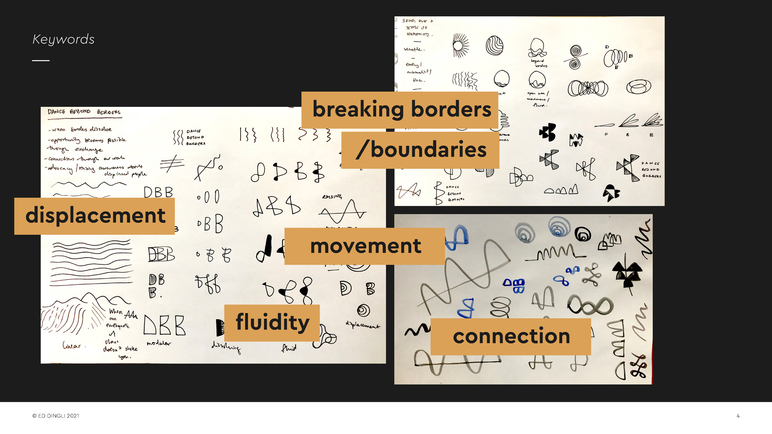
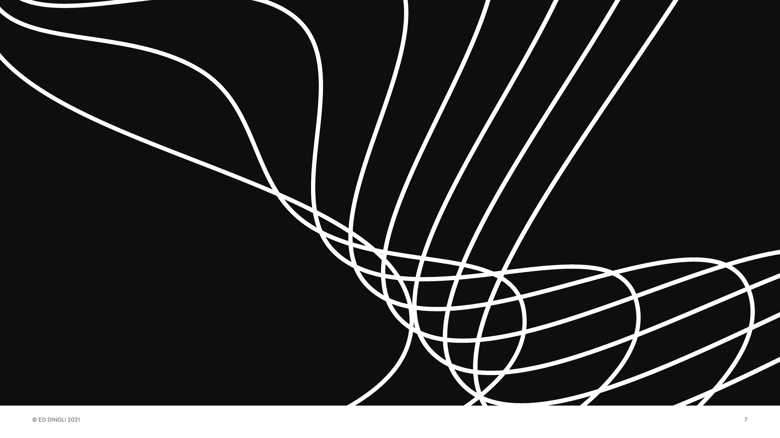
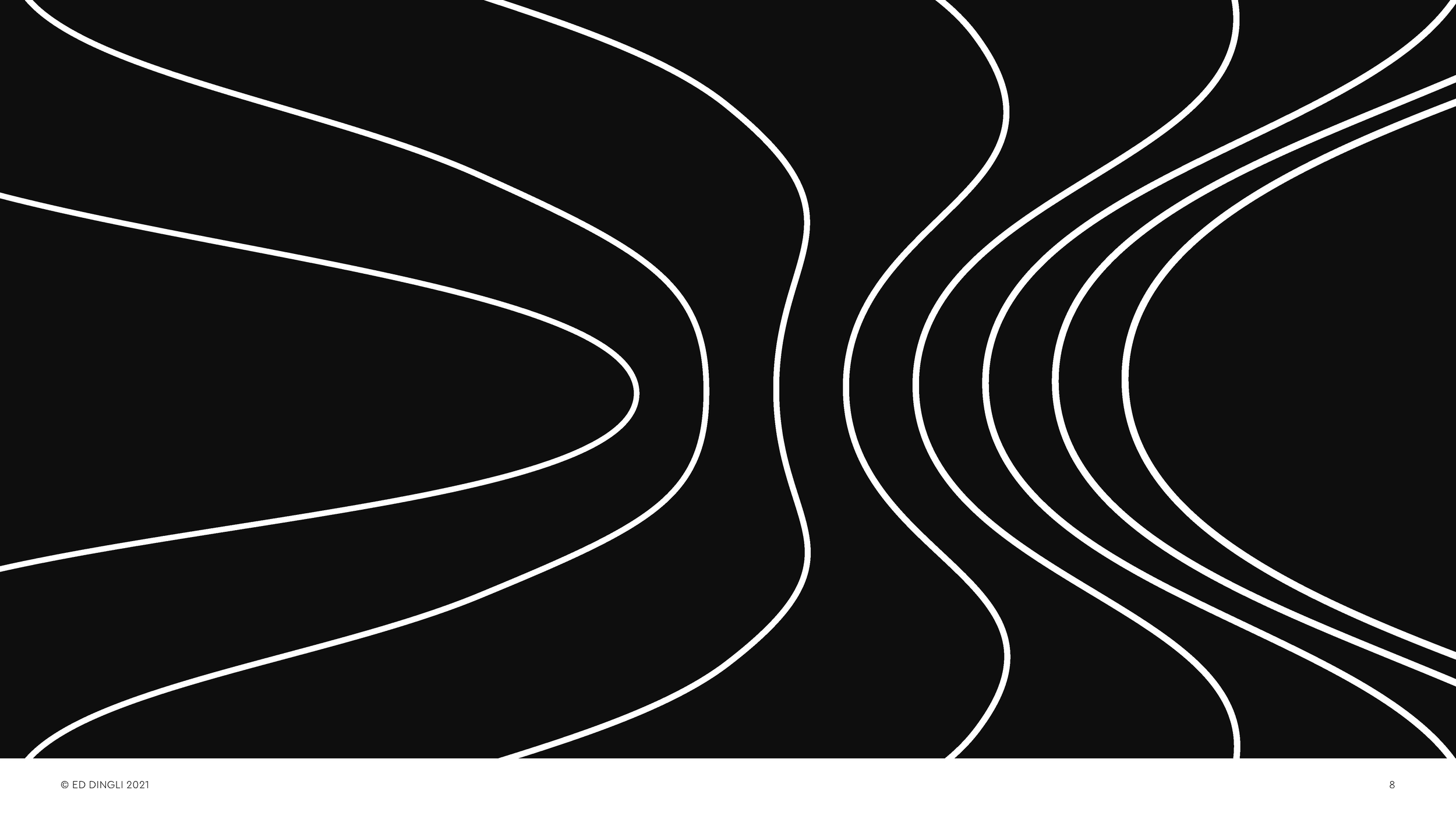
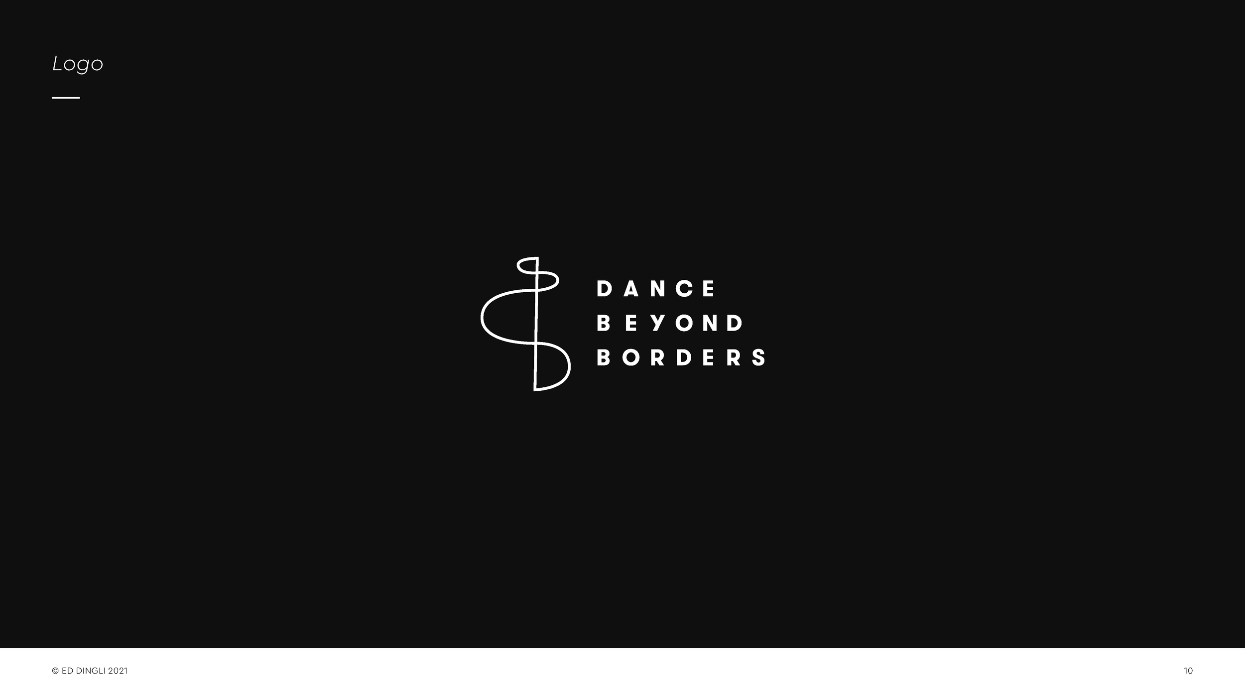
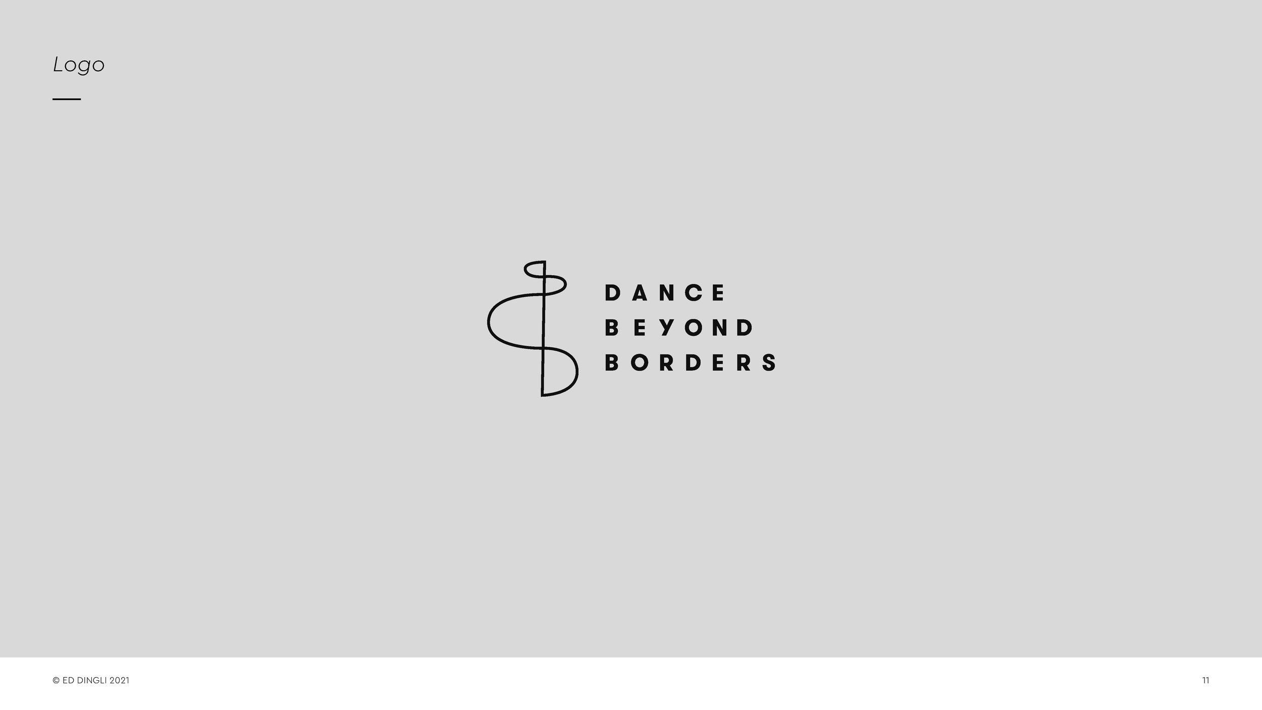
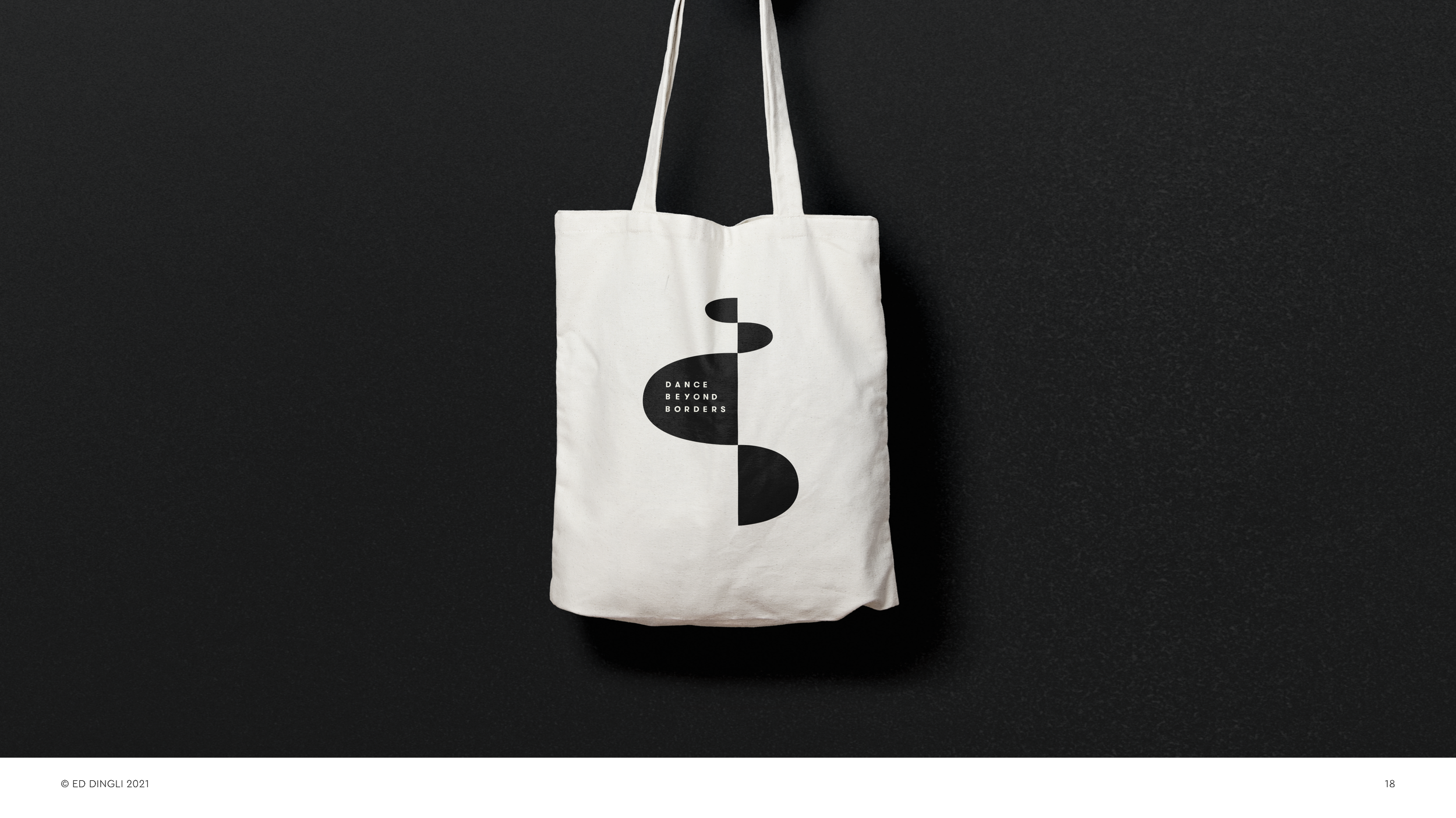
Visual identity for Dance Beyond Borders - a dance activist organisation sharing stories of displacement and uniting people through research, performance and community projects.
To create the identity, I explored the relationship between the letters, applying movement and fluidity and expressing the idea of dissolving borders.
The resulting identity plays on the notion of going above and beyond the metaphorical ‘line’, creating pathways towards integration through dance and movement.
Rebranding a classic
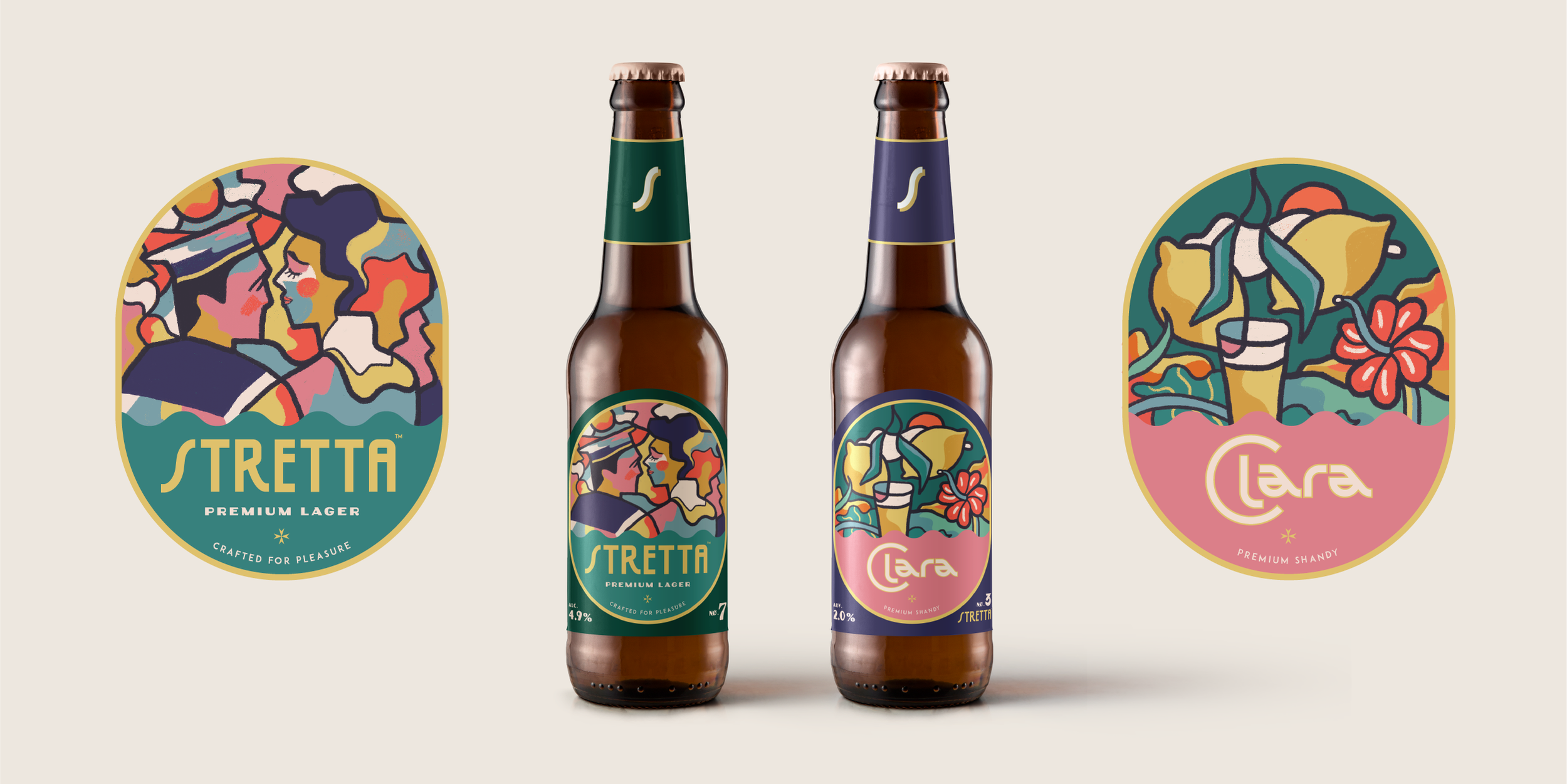
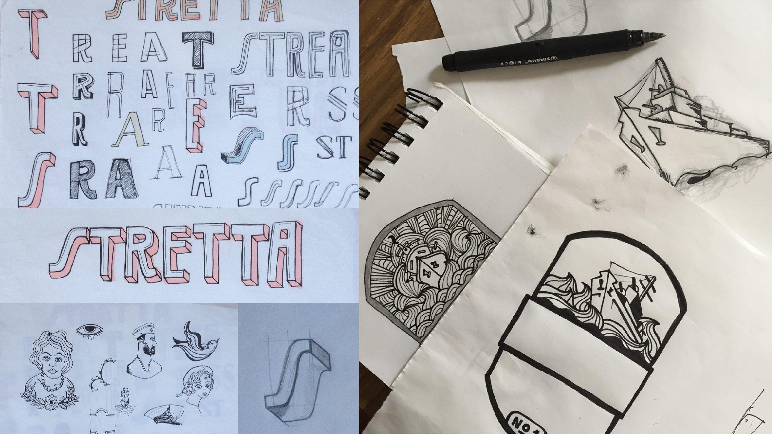
A few moons ago I was asked to create an identity and design the labels for one of Malta’s first artisan beers: Stretta. The beer was inspired by Strada Stretta, an infamous street in Malta’s capital Valletta, where navy sailors mixed with Maltese maidens amid drunken revelry and debauchery in the many bars and brothels in the street.
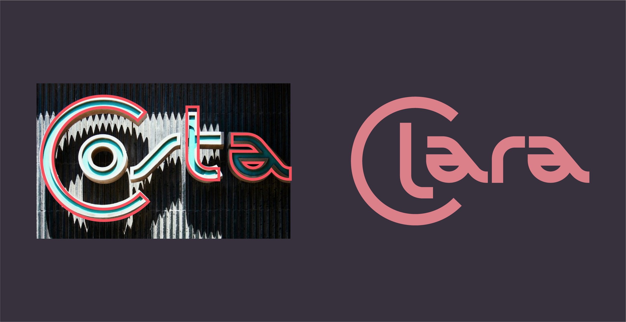
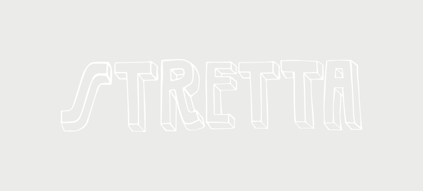
The original labels I designed depicted a ship leaving the Grand Harbour, leaving behind memories treasured and others less so. I constructed the main brand typography using letters from existing iconic bar signs found in the street. Fast forward to now and brewmaster John and I felt the labels could do with a bit of a refresh. Retaining the nostalgic inspiration while creating something fresh.
My challenge was to try and create something timeless and iconic. I started by creating an illustration that’s meant to capture a moment in time…a sailor locked in a moment’s romance with a lover in a whirlwind of drunken desire - thoughts and obligations of home pushed aside for a second in hesitation, surrounded by the festive revelry that the street was notorious for. I used Toulouse Lautrec’s sketches from parties of his time as reference, really enjoying the way he captured movement and festivity.
I kept the typography that’s inspired by the signs yet with some tweaks to make it work better in the new layout, and added a new font for ‘premium lager’ inspired by the Art Deco style of the time.
Designed an identity from scratch for new choc on the block BRICK. Made using ethical cocoa, palm-oil free, packed in recycled paper and printed with vegetable based inks (and the tastiest choc you'll ever taste - I can testify). I created a custom typemark based on my ink drawings, pairing this with abstract patterns that are inspired by the quirky and fresh flavours that the bars contain. The bars are wrapped in coloured recyclable foils ala vintage confectionary. Made in Manchester.
Your Kombucha is a brand of homemade fermented tea (kombucha) lovingly made on the island of Gozo. Boochmaster Wayne has been in love with the natural drink ever since his grandma made it when he was little. He now brews and bottles it at home on the island, giving workshops to adults and school children while spreading the kombucha love. Since kombucha is alive (contains live raw cultures), I wanted to convey the feeling of nature springing to life - using Gozo’s natural flora and fauna as inspiration: borage, caper flower, nasturtiums, hibiscus…all big attractors of pollinators which are essential for life in many forms. A naturally fermented Kombucha made in Gozo - inspired by Gozo, and full of probiotic natural goodness.
With Reason is a podcast series that explores intelligent thinking for turbulent times, from New Humanist magazine and the Rationalist Association. It features interviews with writers, researches and academics who speak to our age - on subjects including religion, belief, race, politics, sex, technology, science, work and more. I was tasked with creating the identity for the podcast series. I used the tagline ‘intelligent thinking for turbulent times’ as inspiration, trying to convey this in graphic form. I paired this with a simple, typographic identity that acted as a platform to whoever was being interviewed.
The United Nations Development Programme approached Nice and Serious to develop a graphic language for their Green Commodities Programme. The GCP needed a brand refresh, which included a new lock-up and a set of guidelines that needed to work closely with UN branding. After consultation with the N&S strategy team, I began the design refresh by creating a set of icons to visualise each commodity that the GCP represents, and then expanded the idea out into a graphic language that used single-line drawing and photography, eventually putting all this into a set of guidelines.
I had the pleasure of being commissioned by architecture studio Floating World to create the brand of The Bagel Hole and therefore accompany the beautifully designed space with a host of graphics and illustrations. The NY-style bagels are made using fresh, sustainable and locally sourced ingredients, and the space itself is delightfully designed and features a host of artisan and custom-made products that are excellently curated by founder Suzi. I created a custom typemark which worked well as a circular, bagel-shape format, to be used as a stamp on cards and receipts. I also created a host of custom illustrations for the menu, seasonal products and for the space itself. Check it out on thebagelhole_vlt
Useless is a guide to living a more zero-waste life in London. It maps out every borough’s zero-waste stores and provides links to essential kit to help ditch disposables. Grown frustrated at the amount of plastic we were forced to consume on a daily basis, the Nice and Serious design team got together to brainstorm a creative response to the plastic mess the world is in. Useless was born… a curated survival guide to a zero-waste life in London.
Check it out: useless.london
Winner of Design Week Social Design of the Year Award
Featured on Dezeen’s top design projects 2019
Ducking good cider 🍎 🍏
Really enjoyed working on this identity and packaging design for Ugly Duckling, a new craft cider brand made from ‘wonky’ apples discarded by UK supermarkets.
The identity itself is inspired by rough cut-outs and handmade prints, celebrating the imperfect nature of the discarded apples. The playful approach is paired with minimal packaging to reflect the brand’s position as an accessible fine cider.
The Daphne Caruana Galizia Foundation is an independent NGO created by the sons and husband of the investigative journalist Daphne Caruana Galizia, who was assassinated in a car bomb attack in Malta. The organisation was set up to ensure full justice for Daphne’s assassination, as well as support efforts to protect investigative journalists all over the world, support independent and non-partisan media and end impunity for the murder of journalists. .
I wanted to capture Daphne’s artistic flair in a Matisse style line drawing, so I collaborated with portrait artist @serafimovaserafima who managed to capture her in a few lines. Daphne’s iconic face is complemented by bay-leaves, a motif that came to symbolise her in protests following her murder.
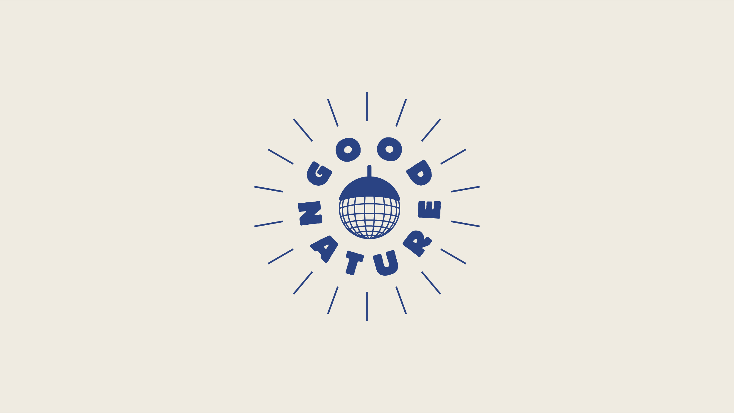
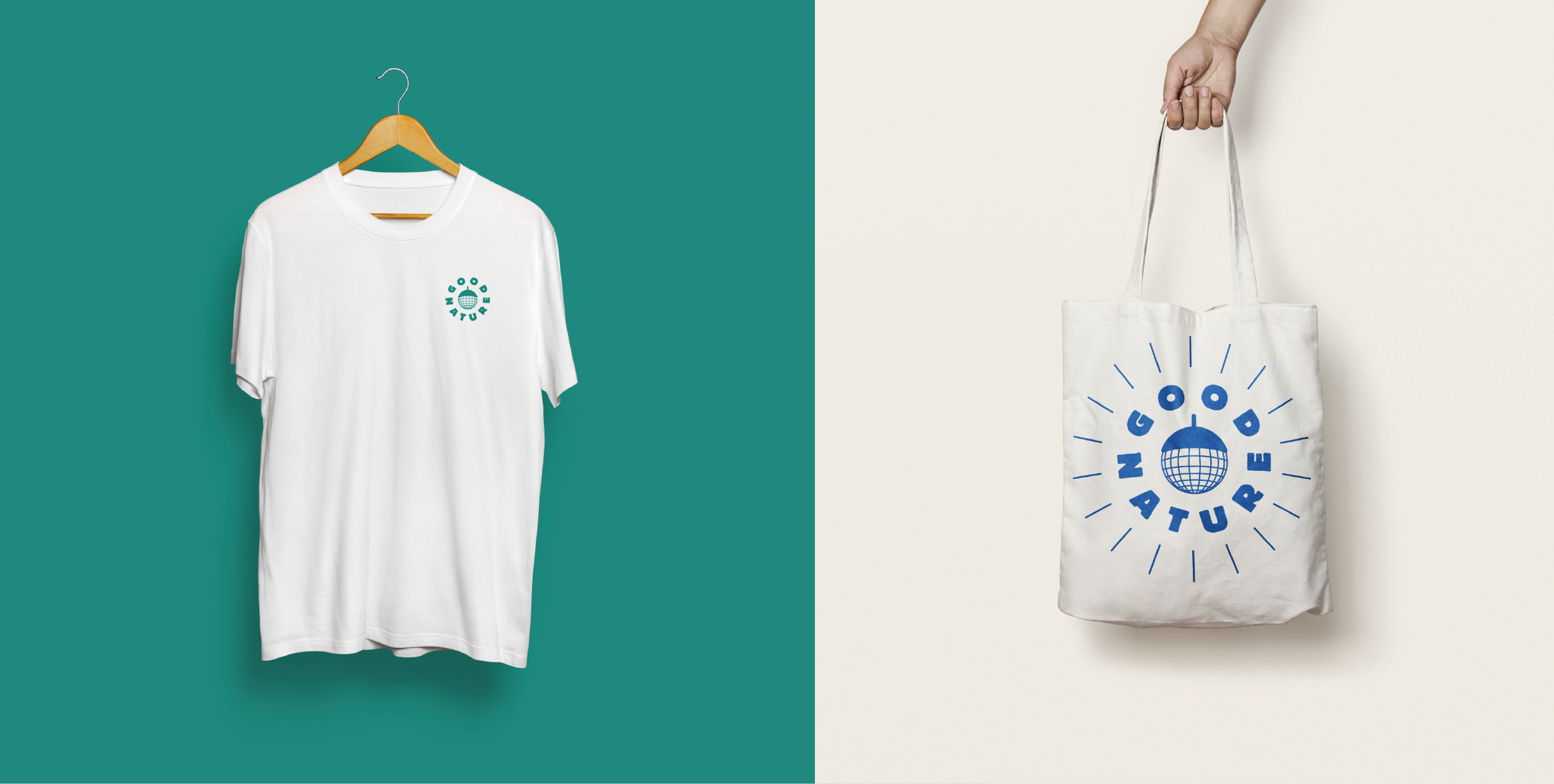
Good Nature is an ethical events company with a passion for music, the planet and having fun on it. They create spaces to connect, delight and dance, with the aim of donating profits to planet-oriented charities and projects, as well as funding their own environmental ventures.
I found inspiration in the parallels between patterns in nature and patterns in sound, exploring the cross-overs between the concentric lines formed out of natural tree rings, and the way sound waves travel through space.
Credits: Woodcut prints by Bryan Nash Gill, used for concept purposes only.
Gif animation by Jeremy Debattista
Stretta was one of Malta’s very first craft beers, and I was delighted to be asked to come up with the visual identity, lables and supporting assets. It is a relationship that has lasted ever since the birth of the beer in 2016, with the brand releasing four new beers along the way.
The inspiration for the brand was provided by Strait Street (Strada Stretta), the narrow street in Valletta that Stretta is named after. Nicknamed 'The Gut', the street was notorious for drunken debauchery caused by sailors and servicemen of the Royal Navy, who were based on the island at the time. It was here that drink, sex and swinging jazz thrived, and Strada Stretta revelled in it. Many of the old bar signs are still visible in the street today, providing me with the perfect inspiration to create a custom typemark at the centre of the brand.
People seeking asylum in the UK are banned from working while they wait months, or sometimes years to hear back on their refugee status. Giving them the right to work means giving someone a chance to provide for themselves as well as a chance to integrate with society. At Nice and Serious, I worked on creating the branding for Lift the Ban, a coalition working to help people seeking asylum gain the right to work in the UK. It has been amazing to see how people have adopted the logo and used it in their own way in various protests and #lifttheban campaigns.